

Mobile SEO focuses on making websites easier to use and understand on smartphones and other smaller screens. Since many people access websites through mobile devices businesses need to ensure that their online presence works properly across different screen sizes.
A website that looks perfect on a desktop computer may not provide the same experience on a smartphone. Text can become difficult to read. Buttons may be too small. Images can extend beyond the screen. Navigation can become frustrating.
These problems can affect the user experience and may reduce the number of people who continue exploring a website.
Responsive web design is one of the foundations of mobile optimisation. A responsive website adjusts its layout according to the screen being used. This allows the same website to provide a suitable experience across desktops tablets and smartphones.
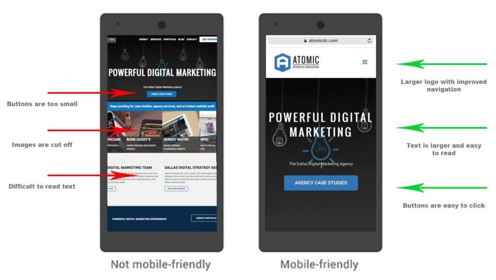
Readable text is particularly important. Visitors should not have to zoom in repeatedly to understand an article or service page.
Buttons should also be easy to tap. Important actions such as contacting a business requesting information or purchasing a product should not be difficult to access.
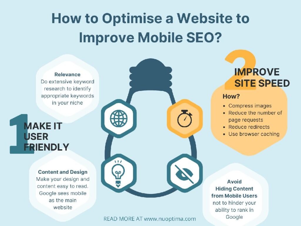
Page speed is another major consideration. Mobile users may browse through different networks and connection speeds. A website that takes too long to load can cause visitors to leave.
Images should therefore be compressed appropriately. Unnecessary scripts should be reduced where possible. Website code and hosting performance can also influence loading times.
Mobile SEO also involves navigation. A visitor should be able to understand where they are and how to reach another part of the website.
Menus should not become overly complicated. Important service pages should remain easy to find.
Forms should also be simple. A long form with many unnecessary fields can be difficult to complete on a smartphone.
Businesses should think about what mobile visitors are likely to need. A local customer may want a phone number address opening hours or directions. These details should be easy to access.
An ecommerce customer may want to search for a product compare options and complete checkout. Each step should work properly on a mobile screen.
Content also needs to be readable on mobile devices. Long articles can still work well but they should be structured clearly. Headings and paragraphs can help readers move through the information.
Images can support content but they should not overwhelm the page.
Mobile SEO should also be considered during website redesigns. A design that looks impressive on a desktop may not automatically provide a good mobile experience.
Businesses should test important pages using different devices and screen sizes.
Mobile SEO is closely connected to overall website usability. When visitors can easily navigate read and interact with a page they are more likely to stay longer and continue exploring.
A strong mobile experience can therefore support both SEO and business performance.
Mobile optimisation is not something businesses should treat as an optional extra. It should be considered part of the basic website experience.
A website that works well on mobile devices provides a stronger foundation for organic search visibility and customer engagement.
